WWDC20 Dub Dub Diary, Part 1
From June 23 to June 26, WWDC20 was hosted online. I was lucky to win the last WWDC18 and WWDC19 event, and I went to America alone and enjoyed it. So I couldn’t feel the heat, the atmosphere and the communication with new people this year. Still, I could see what the developers were talking about on Twitter, so I felt more interactive and closer. Although a lot of time has passed, I wanted to write about WWDC20 as a blog this year, so I wrote the first one.
Apple Developer Forum
Before starting, the first thing I want to talk about is the redesigned Apple Developer Forum site. It was first unveiled for WWDC20 so that it can be easily asked and answered. The questions were categorized, and there were labeled by tags. These were useful for finding questions or answers. In fact, many people asked questions through the Forum site during WWDC20, and not only Apple engineers but also other developers were able to answer them, so they were able to get answers a little faster. I thought this kind of redesigned Forum site made WWDC20 more exciting and developers got more into each other faster.
Keynote
I was expecting how the keynote will show online, but it came out better than I expected. Especially, it was cool of the transition as if it was taken with a drone at Apple Park. Tim Cook, Craig Federighi and other presenters were in front of a very big TV, it was just so amazing. I felt like I was hearing alone with the presenter, and I could concentrate much more on the presentation. And it was also good that the presenter’s environment changed depending on the situation. For example, when describing the new watchOS 7 being able to recognize dance moves, it was presented by a dance studio, and when it was HomeKit, it was presented in a living room with a big TV. These details seemed to have paid a lot of attention, which made them very different from other past keynotes.
iOS 14
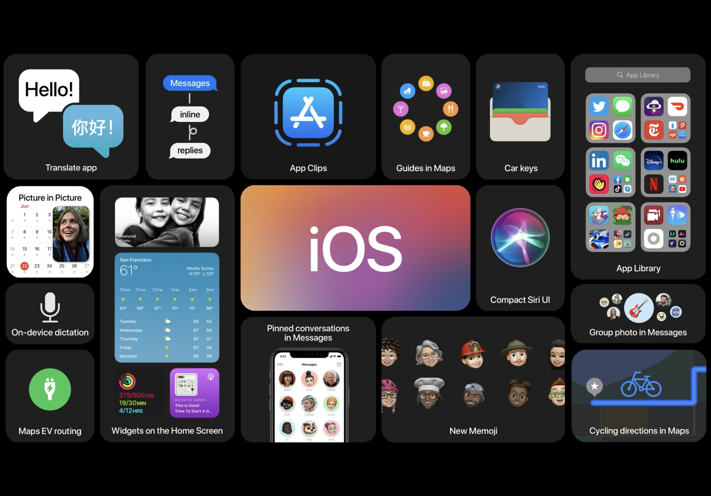
- App Library
- Homescreen widgets
- Picture in Picture
- App Clips
- Translate app
- Compact Siri UI
New features such as App Library, Widgets, PIP and App Clips have been announced. Features that might have been seen in other OS have been added to iOS 14, but the interesting part was the App Clips. You can use apps that can be used very lightly from NFC or QR codes without installing them. If making a good use of these things, it would be great to encourage users to use the app without having to install it. If they like using it or been using it frequently, users can install it and use it as usual. I think focusing on Widgets and App Clips will be the main thing on iOS 14 this year.
iPadOS 14
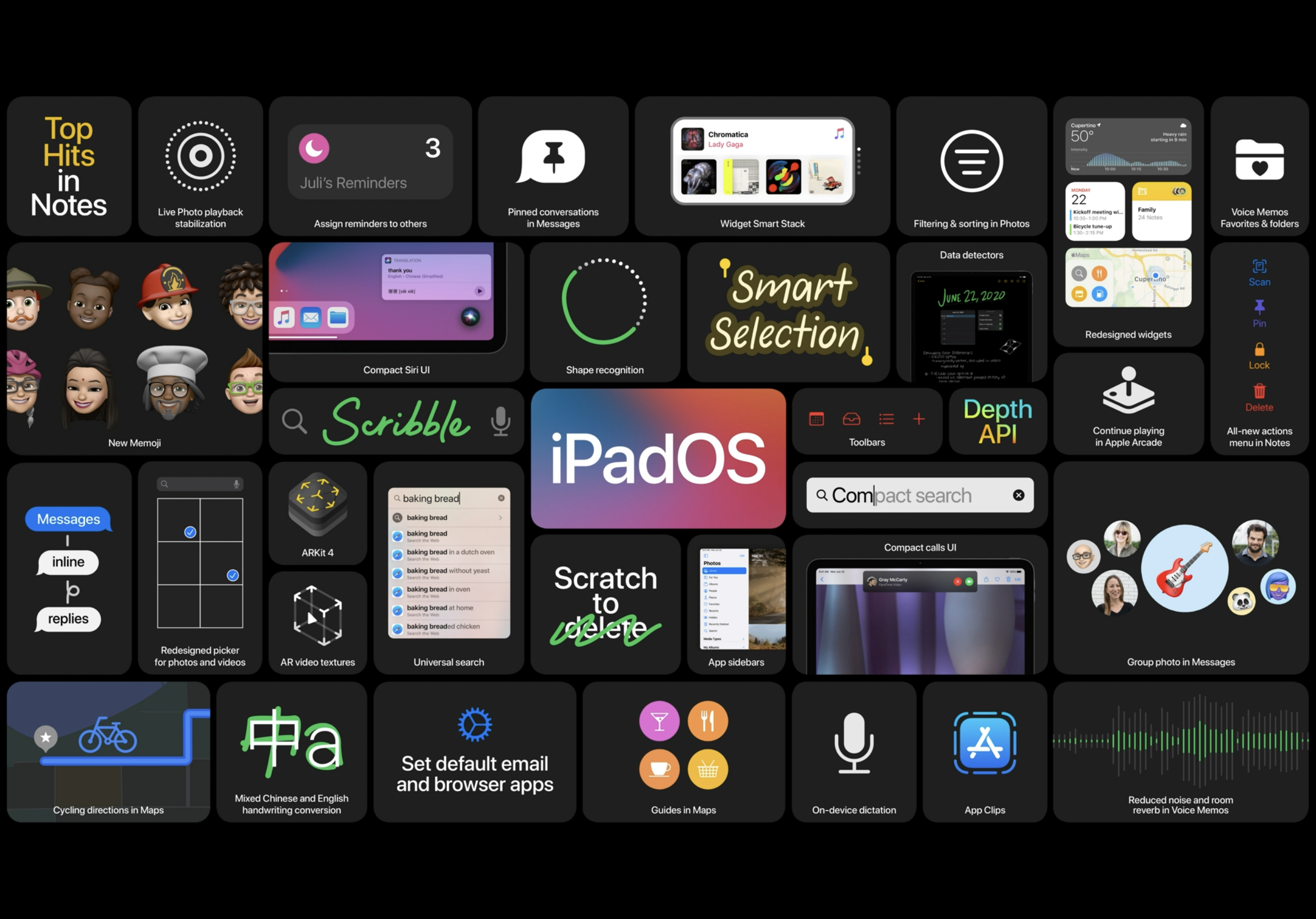
- Compact calls UI
- Search (Spotlight)
- Scribble
In iPadOS 14, compacted phone UI and other new features were announced. But the most memorable thing was the Scribble feature. Using an Apple pencil to write a phrase becomes text, and selecting or deleting text with the Apple pencil is now available in iPadOS 14. This feature makes iPad more useful for people studying on the iPad with the Apple pencil or writing with it. Now, little by little, Apple seem to be pushing for an inseparable relationship between the Apple pencil and the iPad.
watchOS 7
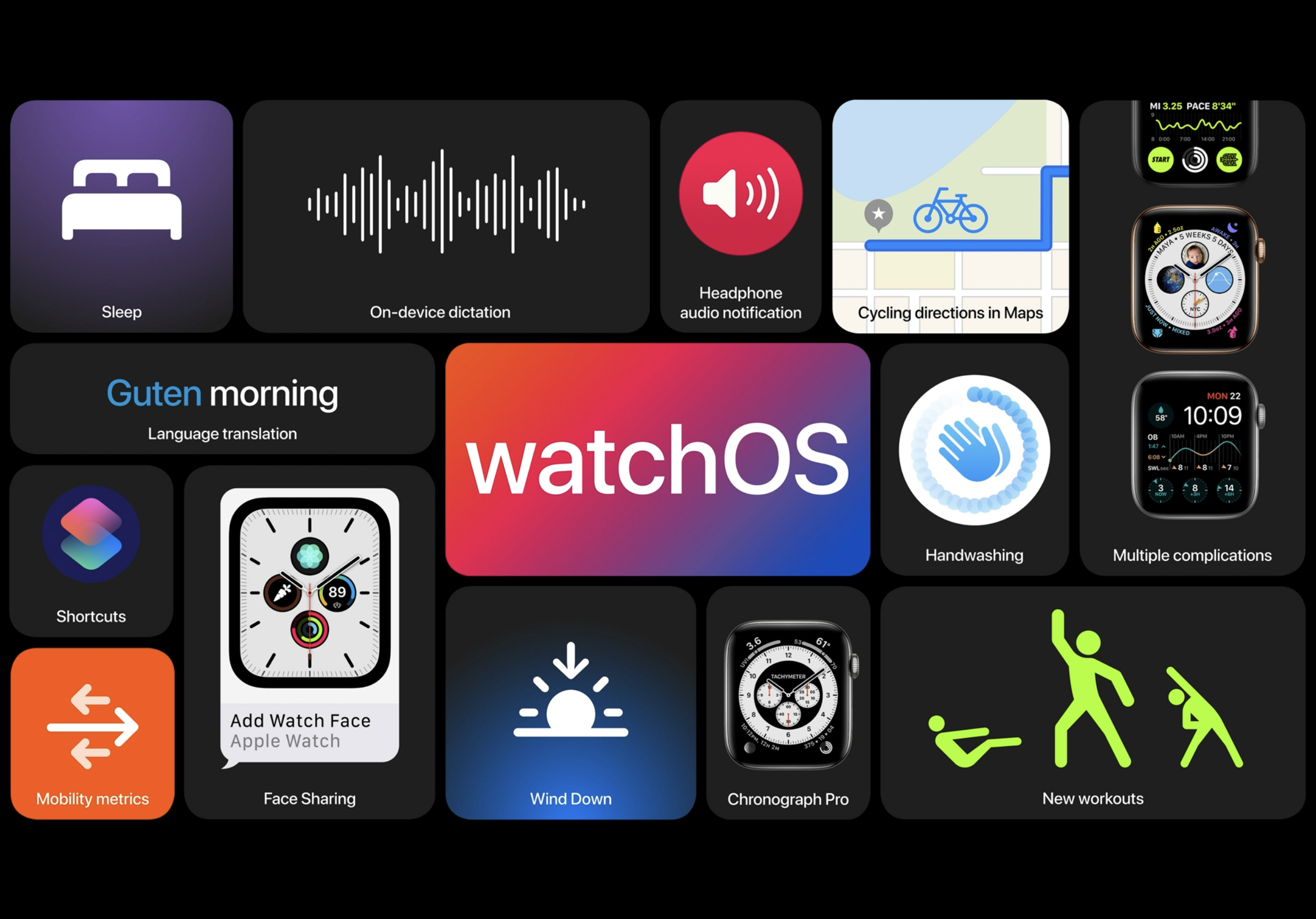
- Sleep tracking
- Hand wash detection
New dance functions and sleep tracking functions have been added, but the hand washing feature is what I liked the most. Now that it is important to wash your hands and wear a mask, with Apple Watch you can take care of your health more than before. Just as Apple Watch cares much about health, I thought that health-related apps would be the best fit for Apple Watch in the future.
macOS Big Sur
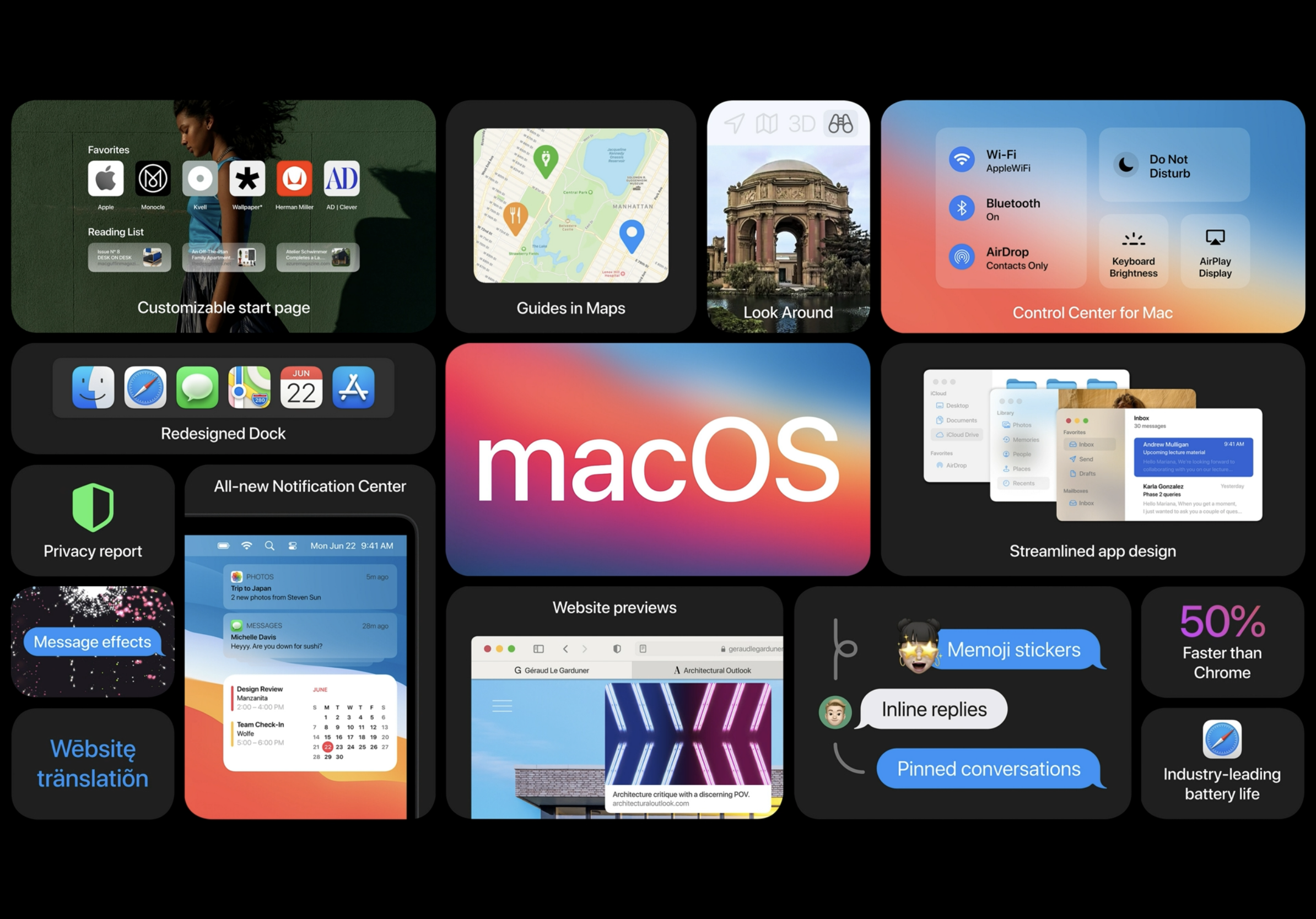
- New UI Design
- Control Center
- Native translations in Safari
MacOS has changed the design of the UI on a large scale. I felt as if I was looking at the old iOS 7 design. The icons went back to the neumorphism design, which seems to be the middle of the design of skeuomorphism and flat. Since last year, neumorphism designs began to be seen little by little, but I never expected them to come out from macOS Big Sur new design. I felt that macOS followed the trend of design. In addition to the new UI design, control centers that were seen on iPhones and iPads have become available on macOS, and website translation functions have been added on Safari.
Apple Silicon
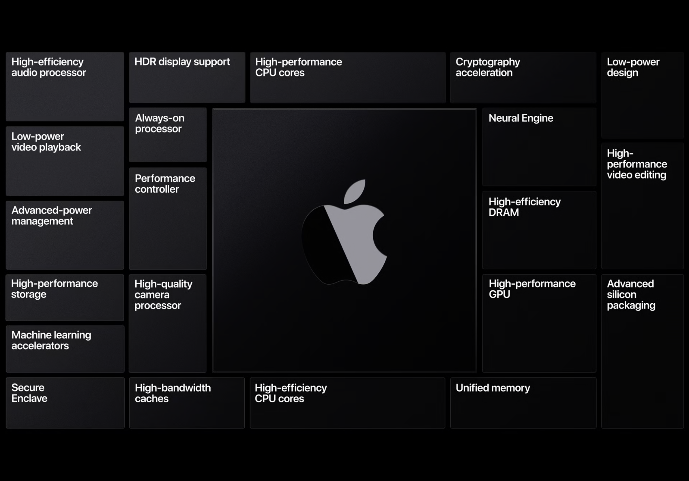
Apple Silicon. ARM Mac products will be available, and iOS/iPadOS apps will be able to run natively. With Apple Silicon in the Mac, it will create a common architecture across all Apple products, developers can optimize apps for all environments. Mac products with Apple Silicon will be released at the end of the year and a complete transition will be made within two years. I want to use Mac products with Apple silicon as soon as possible.
Platforms State of the Union
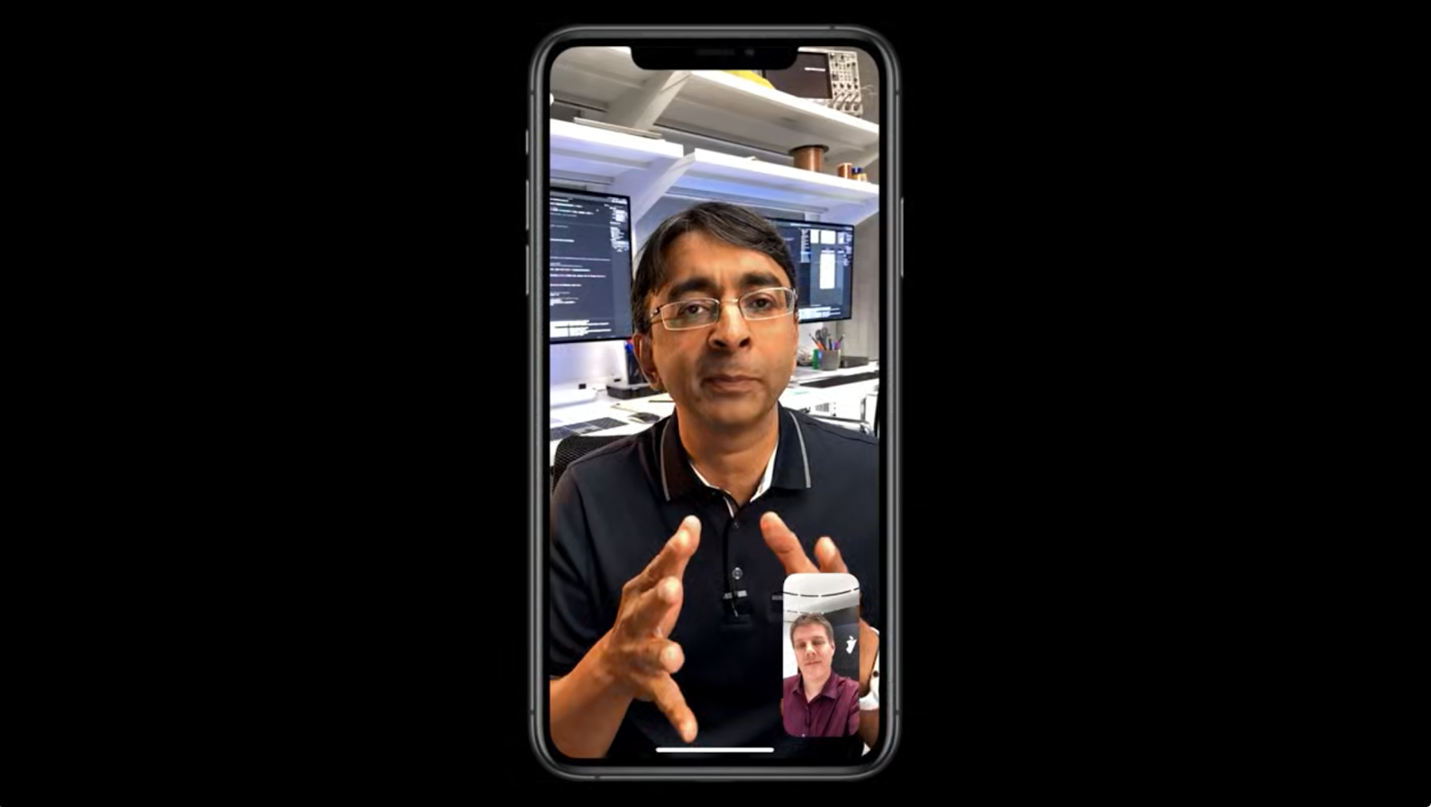
I once thought the Keynote was important, but what I learned after visiting WWDC19 last year is that Platforms State of the Union is a must-see session for developers. This session is for developers to learn more about new features and meet engineering leaders. In this WWDC20, we were able to meet various engineering leaders, and what was interesting was the scene where they talked about Apple Silicon through Facetime. We could briefly see more diverse features, including Sidebar function in iPadOS, color use in macOS, and a simple demonstration of Widget development in iOS 14.
Wrap up
The video quality of this online WWDC was so good and was designed to focus on the presentation. I couldn’t feel the sense of realism as much as before, but was able to satisfy because I could see the developers talking about WWDC while watching it online. Although I did not enjoyed the Keynote in real time, my desire to develop more has grown whiling writing this article. From now on, I decided to write mainly on fun sessions that was released on WWDC20, and I hope good articles come out.
