SwiftUI에서 커스텀 버튼 스타일 구현하기
ButtonStyle 프로토콜을 사용한 커스텀 버튼 스타일 만들기
SwiftUI에서 커스텀 버튼 스타일 구현하기
스위프트에서 버튼을 만들 때 애플에서 기본적으로 제공하는 스타일에 맞춰서 만들 수 있다. 하지만 앱의 특성이나 상황에 맞춰서 다양한 스타일을 적용하고 싶다면 커스텀 버튼 스타일을 만들어서 적용할 수 있다.
기본적인 버튼 스타일링
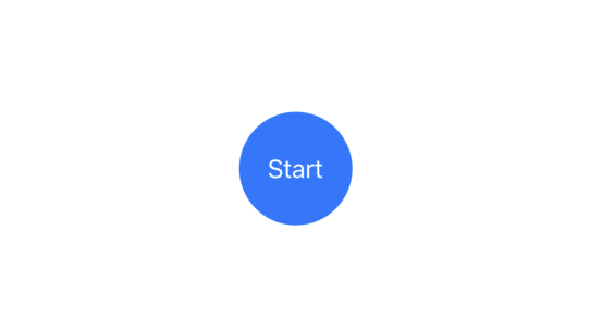
아래 예시는 간단하게 버튼에 스타일을 지정했다.
1
2
3
4
5
6
7
Circle()
    .fill(.green)
    .overlay {
        Text("Start")
            .foregroundStyle(.white)
    }
    .frame(width: 75, height: 75)
커스텀 버튼 스타일 만들기
하나의 버튼에 스타일을 지정하면 괜찮지만 앱 전체적으로 여러 버튼에 동일한 스타일을 적용해야 한다면 여러 코드들을 복사 붙이기해야 한다. 이럴 때는 ButtonStyle 프로토콜을 채택한 새로운 구조체를 만들어서 버튼의 configuration을 이용한 커스텀 버튼 스타일을 대신 만들어 사용한다.
1
2
3
4
5
6
7
8
9
10
11
12
13
14
15
16
17
18
19
20
21
22
struct CircleStyle: ButtonStyle {
    func makeBody(configuration: ButtonStyleConfiguration) -> some View {
        Circle()
            .fill(.green)
            .overlay {
                configuration.label
                    .foregroundStyle(.white)
            }
    }
}

struct ContentView: View {
    var body: some View {
        Button {
            //
        } label: {
            Text("Start")
        }
        .frame(width: 75, height: 75)
        .buttonStyle(CircleStyle())
    }
}

SwiftUI의 환경(environment) 시스템을 활용해서 버튼의 색을 커스텀 버튼 스타일 내부가 아닌 외부에서 지정할 수 있다.
1
2
3
4
5
6
7
8
9
10
11
12
13
14
15
16
17
18
19
20
21
22
23
struct CircleStyle: ButtonStyle {
    func makeBody(configuration: ButtonStyleConfiguration) -> some View {
        Circle()
            .fill()
            .overlay {
                configuration.label
                    .foregroundStyle(.white)
            }
    }
}

struct ContentView: View {
    var body: some View {
        Button {
            //
        } label: {
            Text("Start")
        }
        .foregroundStyle(.blue)     // 외부에서 스타일 지정
        .frame(width: 75, height: 75)
        .buttonStyle(CircleStyle())
    }
}
버튼 상호작용 상태 처리하기
ButtonConfiguration에 있는 isPressed 프로퍼티를 사용하여 버튼이 눌렸을 때의 시각적 피드백을 구현할 수 있다.
1
2
3
4
5
6
7
8
9
10
11
12
13
14
15
struct CircleStyle: ButtonStyle {
    func makeBody(configuration: ButtonStyleConfiguration) -> some View {
        Circle()
            .fill()
            .overlay(
                Circle()
                    .fill(Color.white)
                    .opacity(configuration.isPressed ? 0.3 : 0) // 눌렀을 때만 하이라이트 표시
            )
            .overlay {
                configuration.label
                    .foregroundStyle(.white)
            }
    }
}
이 기사는 저작권자의 CC BY 4.0 라이센스를 따릅니다.